IHOP LOGO HISTORY
The IHOP brand has been around for over 50 years! Over that time, IHOP’s logo has seen some changes. Check out the journey below.
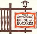
1958-1982
IHOP began as the International House of Pancakes back in 1958. The original logo was part of the chain’s distinctive, chalet style signboards. These signs famously lined American highways throughout the 1970s. The original logo lasted nearly 25 years, retiring in 1982.
1982-1994
In 1982, the International House of Pancakes changed its logo for the very first time. The new logo kept the old color-scheme, but used a smoother, more streamlined design.
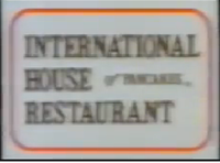
1994
In what will surely go down as the shortest-lived design in the company’s history, the logo switched again 12 years later. Even though it lasted less than a year, elements of the design might look familiar to some customers…
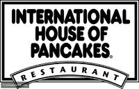
1994-2015
Way back in 1973, the International House of Pancakes began using the term “IHOP” in ad campaigns. In 1994, the company switched to the name officially. The new logo used elements from the abandoned design of earlier that year, and switched to the now-familiar red, white, and blue color-scheme.
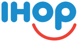
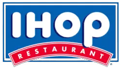
2015-Present
Say hello to the brand new IHOP. IHOP’s latest logo is the IHOP Smile. Think of all your warm, happy memories of breakfasts, brunches, lunches, and break-the-mold evenings spent with family, friends, pancakes, and syrup. Then think of the IHOP Smile.